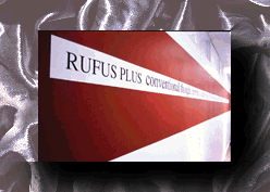
| "RUFUS PLUS
conventional thought, portraits, a death mask or two and
some busts, grimed in critical debate. Whenever museum
research was necessary, Rufus 73." by Bruce James |
|
|
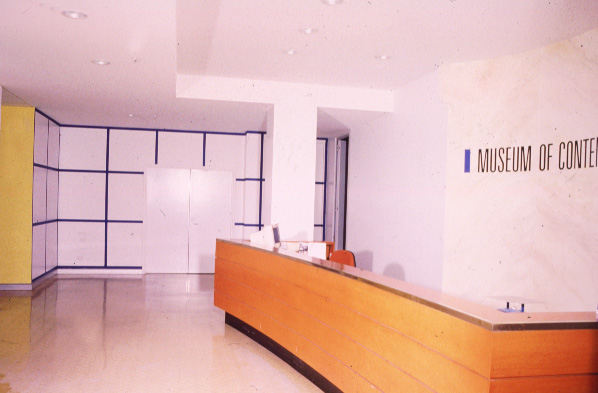
A persuasive and pleasing instance of modern mural
painting, incorporating the curious text above, can be
found in the Museum of Contemporary Art at Circular Quay
West in Sydney. The venue is surprising. Sydney’s MCA is not automatically associated with painting at all, let alone the suspect sub-genre of wall painting. In the structure’s previous incarnation as the Maritime Services Building it did house a variety of decorative artworks - a vast and belatedly Art Deco concoction by Sydney Modernist Rah Fizelle, complete with utopian vistas of cloud-piercing towers buzzed by dinky bi-planes - but the present purist interiors introduced by architect Andrew Andersons were, until now, inimical to any species of painted decor except the white veneer of modern museology. Even the multi-panelled opus crafted by Imants Tillers to commemorate MCA benefactors outside the American Express Hall projects sculpturally from the wall, escaping itself as painting. Incidentally, KUNST = Kapital, for so runs its caption, is the only example of a conventionally-frame Tillers I know. Then, in 1995, Sydney-based artist Christopher Snee was commissioned to design and execute a work for the administrative section of the building on level four. The brief, informal as it was, required the artist to respect the innovative nature of the museum as did Andersons’ modulation of it, to address the semi-public function of the nominated site and to achieve a certain condition of visual succinctness which the directors saw as indicative of their wider charter. While managing to observe these encomiums in their turn, the resulting mural observes the final one most diligently of all: it is succinct. |
|
It’s also environmental in the sense that it
occupies three connecting compartments: the foyer, the
boardroom and a long corridor linking these to the
museum’s open-plan office wing. Despite lacking a
cohesive architectural logic, a flow if you like, it
would be hard to think of an interior, other than in some
of the more lavish corporate vestibules in the city,
which offered so generous a surface and so prime a locus
for artistic attention. Even so, Snee understood from the
start that he was being invited to decorate, and by
inference to solve, something of a spatial non-sequitur -
one that lacked, through no fault of the architect, a
unifying principle of usage. Furthermore, through a
series of windows in the boardroom, the interior competed
with the magnificently diverting foreshores outside -
nature, not architecture, was to be the rival. With respect, Snee was not an obvious choice to take up the challenge. He was not at the time exclusively understood as a maker of murals, but over a number of years his work in that genre had quietly recommended itself to Bernice Murphy and Leon Parossien, co-directors of the MCA. As a regular exhibitor at commercial and artist run galleries in Sydney and Melbourne, a participant in notable curated shows like Peter Timms’ The Black Show and Victoria Lynn’s Perspecta 93, and as an invited artist at international events like the 4th Construction in Process (1993), in Poland and Mal was Anderes in the same year at Berlin’s Kunstlerhaus Bethanien, Snee racked up an impressive number of professional accomplishments. In 1993 he contributed to a thematic exhibition, Pages, curated for the MCA by Linda Michael and largely drawn from its permanent collection. Snee showed Paradise of Dreams (1989-91) a striking wall-piece constituting 127 printed book pages bearing interventions by the artist (and at that point proposed for acquisition) and Pictures (1992) all at once, a wall painting derived from a related book project, A Long View of Nothing. It was the self-evident aplomb of this mural-sized conception that convinced Murphy (as a the more hands-on of the directorial duo) that Snee had reached maturity as a muralist. There was also consensus that Pictures all at once succeeded as public art. With its harmonious disposition of the three primary colours and its uplifting verticality, it invoked a definite joie de vivre. At a group show, Above the Lake and Below the Sky, in Benalla in 1992, and at his dealer gallery in Sydney (1993-4), the painter trailed and perfected the upscaling procedures that led from the book pages to the wall murals. He was ready for the MCA commission. |
RUFUS PLUS
|
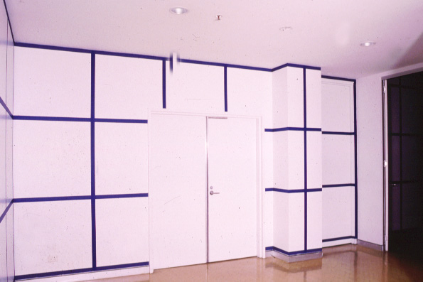
On exiting the elevator and to the left there is an
insistent graphic configuration. Architectonic, indeed
geometric, this painted feature is a grid of blue lines
about three fingers broad, from floor to ceiling against
the white of the wall. Initially, these lines might be
deciphered as solid structures which establish, and at
the same time perforate, the suggestible third dimension
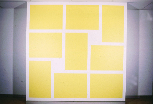
of aerial space. The effect is lattice, seen through. It can be no coincidence that the lattice is one of the simplest and most venerable motifs of mural art. Greco-Roman and Hellenistic examples abound, many realised with forceful illusionism. In Classical times the stereotype was typically of a garden trellis, or espalier, often intertwined with plant growth and exploited in the manner of a repeated pattern adapted over large areas. In this guise it endured virtually to the present day, achieving its zenith in the 18th and 19th century. The Rococo was particularly rich in variations of it. In the 20th century commercial wallpapers represented the last flowering of the lattice as a decorative proposition of populist appeal. On this score, lattices continue to enjoy two modest but almost universal applications in contemporary visual culture: as the rectilinear basis of the game Noughts and Crosses and as the # sign on our telephones and keypads. I do not underestimate the deeper connective power of either of these. Nor do I fancy, does Snee. Of course, in the lineage of high Modernism from Mondrian to Sol Lewitt, the lattice, in its function as grid, has profounder applications. These aren’t absent from Snee’s work, especially an idealistic notion as to the perfectibility of form through geometric practices. It merely seems that in this portion of the mural, for all its sophistication, he is connecting into and operating on visual states familiar to us all rather than to some esoteric or specialist archive of aesthetic reference. To that degree the work is vernacular - or at least has a vernacular aspect, even a democratic one. The human scale of the piece is not simply worth noting, it announces itself boldly. The ‘holes’ created by the crossbars of his lattice are each as big as a comfortably curled body. There’s no temptation to think of them as the constricting apertures of a cage, or portcullis. Whether intentionally or no, Snee has produced voids which are in every sense breathing spaces. The painter was well aware of the necessity to provide this wall - feeding as it does into the adjacent boardroom - with just such an uncluttered, open design to guide the eye without inhibiting the free processes of thought or physical movement itself. In short, he resisted the common muralist’s syndrome of the horror vacui. In addition, by choosing the primary colour blue (like a good Suprematist Snee restricts himself to the primaries) he ensures the viewer experiences the lattice as a phenomena of lightness, even fragility. Memories of blue and white porcelain emanate from it - clouded skies; ruled paper; sugared eggs; a creche. Being conducted in this amicable way into the boardroom, I turn to face a long window-lit chamber set with a minimalist bench and moulded black chairs. This bench (in reality a pair of modular trestles) is an alter of officialdom ceremonially compressed between two further elements of Snee’s enterprise; on its window side, and hence broken by harbour views, a wall of chrome yellow. |
|
By day, this immoderately bright hue is mitigated by
the shadow cast by the even more brilliant exterior
light. By night I should imagine it effectively
fluoresces. As it is, it serves to pull the three windows
- actually evenly spaced - toward the centre of the wall.
The effect, be it psychological or optical, is a
tightening of the room toward a focus at the table. Here,
after all, the business of culture is conducted. To
emphasise this sacral notion even more, Snee balances the
solid colour of the fenestrated wall with a virtually
independent painting in broken colour on the opposite,
unfenestrated wall. This work is similar to a group of canvas paintings he exhibited under the generic title The Pattern of Virtue at KUNST in 1994, images whose essentially rational geometries were subverted by apparent irregularities. In this case nine rectangles have manifested themselves from the masked-off whiteness of the wall, six horizontal and three vertical. From time to time, though, the white interstices of unpainted wall also assert themselves, in RUFUS PLUS, as solids. Similarly, the three rectangular ‘absences’ of the windows find their substantial equivalent in the blocks of yellow. A conscious interplay of negatives and positives generates across the room, creating a charged and almost palpable atmosphere fully intended by the artist. The meaning of the entire mural installation, such as it may be said, to have a single one, is to be found here. For the remainder of the boardroom walls, Snee has left them pristinely untouched. Leaving the room by a second doorway, a strong flash of red, as matt and muffled as dried blood, causes the viewer to look up beyond average eye level at a band of text commencing with the words "RUFUS PLUS", followed by the quotation which begins this essay. Taken at random from single pages of pro-existing prose, its phrases refer to an anonymous, perhaps generic museum circumstance; artefacts, academic debate and a whiff of mustiness contribute to an image of some archetypal old-world institution clearly at cultural and temporal odds with the MCA. Indeed the strip of text translates as a mock-heroic frieze, or as a version of these elevated rows of illustrious heads of the famous and the wise libraries and museums once felt obliged to display - high up for proper effect of lordliness. All of this of course, is deeply ironic and funny. Snee and his patron, the MCA, have a sense of humour. So must the viewer to take delight in what both have achieved in this memorable artwork. Finally, savouring many more possibilities than those already recorded, I head back for the liftwell. I am startled by a swatch of yellow not registered before. This is the wall colour of a small annexe which marks the initiating edge of the lattice. For whatever reason (and such omissions always have a reason) I had optically supressed it in my concern to engage the firm, supporting barres of the lattice. It might be guessed that I did not wish at that moment to be cast adrift in a luxurious lake of such colour. Leaving now, I take with me, and give myself over to, the chromatic radiance of wave upon wave of pure, formless, holy yellow. January 1996 |